When you think of a company, 95% of the time, the first thing that comes to mind is their logo and what it looks like. Now, what if the company were to completely change their logo? Would this effect how you see or remember the said company?
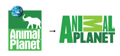
One logo that really took me back is the new Animal Planet logo. For those that don't know, Animal Planet is a channel on TV that dedicates a large portion of their time to shows about animals. The one thing that really catches me off guard is the sideways "M" in the Animal part of the logo. I really don't understand why they did this. Another thing was removing the elephant from their logo. I feel that since the company promotes animals, they should have at least left an animal in there.
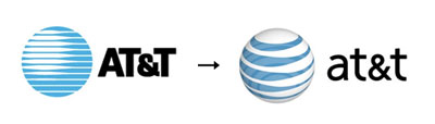
Here is one logo redesign I can actually stand. I really like how they didn't change it up too much and kept most of the older logo in tact. They just gave the older logo a twist and made it look fresh, updated and modern.
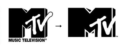
And just for giggles, I thought I would throw the MTV logo in here. Notice anything different? At first glance, not really but they actually removed the "Music Television" from the bottom. As much as I hate to say it, this change was needed. I honestly can't remember a time that wasn't 4am when MTV was actually playing music or music videos. They changed the logo to evolve with the company and it was pretty fitting. They kept their brand identity why dropping the unnecessary pieces of it.
All logo images taken from
Adweek.com.

No comments:
Post a Comment