Sunday, June 26, 2011

I'm not dead...Promise!

I know updates have been sparse BUT the good news is, I've been working on LOADS of projects. Both for work, ReRave and others. I can't get around to posting samples of every single one but I'll throw a few up here until I can get an official post ready.

Album art for a new single on Golden Needle Records. I had actually won a contest and now I do some of their artwork for their new releases.


All of these are for ReRave (I actually have a few more but for some reason can' find my masters and it's frustrating me!) Yes, that is my friend's pug on the "Extra Medium" cover :)

I also had the task creating new pricing signs for work. When I first signed onto the project, I didn't realize that I would just be placing elements onto a Photoshop file and our owners would be designing it. This made the process extremely frustrating and almost made me quit. I do realize that the client has opinions and ideas too but you asked me to design it, not throw it together for you. They were completely not understandnig of the design process and I'm actually really thankful that my classes taught me what they did because it all came in hand throughout the entire process. Either way, the project got finished and printed. I still am not a huge fan of the design and colors but it's what they wanted so I went ahead and did it for them.

Old                                                       New


So that's about it for now. I'll try and keep updating this as best as I can but with summer, work and all of the above, it's hard to keep up.

Tuesday, May 10, 2011

Digital File Prep - Final Project & Thoughts


(Part One)

This is the finished final product for my last project in Digital File Prep. I created the base image in Illustrator and had complications so I was forced to slice it up within Photoshop. The way the points of the graphic were put together wouldn't allow me to cut it in half easily. The back image is also a .tif file, as well as the cropped-out-background image of the cake on the bottom.

The one thing I found challenging was that in order to get the box the final size that I wanted, I would need to cut it in half, print it on two separate piece of paper, and then merge them together in the end physically when I assembled it all. I was also having issues with discoloration in the printed due to a number of variables such as the printer, type of paper and location of the print. This became a frustrating issue since I had a particular color scheme in mind (I'm pretty super picky about stuff like this).

In the end, I feel that I learned quite a bit from the process that started with a simple thumbnail sketch and led all the way into a full scale, 3-dimensional, printed piece. While it may have been frustrating and irritating at times, the final outcome was worth the minor struggles and turned out great in the end.

Cake image from Stock Exchange. All other images copyright Jordan Frederick.

Monday, May 2, 2011

Web-Based Software - Final Site, Flash Animation and Starter Pages

As the semester draws to a close, I'm finalizing all of my projects in my Web-Based Software class.

The first item is my flash animation. This is a short little video clip I made in Adobe Flash CS5 that uses typography as its main subject. I have had a little bit of flash experience in the past, with "little" being the keyword there. For what it is, I don't think it turned out too extremely terrible. Without further ado, Here is the flash video.

Next up on the list is my final site I have completed. I chose to create mine in WordPress as opposed to DreamWeaver as I felt more comfortable with it. I chose a template site and then went to town from there. You can visit the site here.
Final WordPress site

 And finally I have my Starter Pages to show off. This was a basic website assignment in which we took a single index, or homepage, and linked it to 2 other pages that related to it. My main page is about baked goods and then links off to a page about cookies, and another page about cake. You can check it out here.

Saturday, April 30, 2011

New Marketing Techniques


I thought I would post this because it's too good to NOT post. I also thought I'd post it to show how companies are embracing the internet and new ways to reaching their audience to advertise their products. They realized that the core of their audience was online...a lot and took full advantage of using a creative technique to show the product off. While it may be a little strange, it got me laughing and interested in the product. If you click the video, you can see others in the series of advertisements from them. Cool stuff!

Monday, April 25, 2011

Music Production....?!

Yes, You read that right. Music Production. Over the past weekend, I attended an event in Ames, Iowa with my friend who happened to have brought her iPad 2 with GarageBand loaded onto it. Now, I've played around with GarageBand for a little bit (For those who don't know, GarageBand is an audio program) and never really made it too far. I immediatly found that the iPad version of the software was a lot easier to use and pick up.

Now, If you know me, You will know that I like to just make little songs about random stuff I see and improvise them. Now that it's know, I made 5 songs within the span of about 45 minutes. Granted they are only about 15-20 seconds long, They are songs. They are pretty terrible and embarrassing but I'll go ahead and post them for the sake of showing everyone. Keep in mind, these little songs are created on the spot, about things I saw on the highway.


Road Toad by jbean3535
Love From Iowa by jbean3535
Farm Those Strawburries by jbean3535
Chicken Bacon Ranch by jbean3535
45.95 & Up by jbean3535

Wednesday, April 20, 2011

More Exciting Stuff!

More of my work has just been released into the ReRave song store! It really is a rush when you finally get to see the final product in action.


Web-Based - Homepage

In Web-Based Software, we are creating a master page that will act as a homepage and link to all of the projects we have completed during the course of the semester. Some of these projects include a mini flash video, a WordPress Blog, Random Elements pages and Starter Pages which link within their file structures.

Mine is still slightly under construction but as you can see, It is getting off to a nice hearty start and should be up and running fairly soon!

Web-Based - Site Maps

Here is an example of a site map for a website layout of mine.

 You can see where each page links to and flow into the next. In addition, where each page links outside of the internal web structure to an outside page.

Web-Based - Random Elements

For Web-Based Software, we were told to create a page with random elements and tie them together with a graphic, body text and a small email form. Mine was fairly simple and plain.

The site taken from Adobe Dreamweaver.

Monday, April 18, 2011

The Final Project (Dun dun dun!)

Yes, it has finally arrived. The time to do my final project for Digital File Prep. For this project, we are required to create a piece that has some type of folding to it, whether it be a brochure or a three dimensional object out of the paper.

I chose to create a take-out carry along box for a fictional bakery called "Yum!". I found a template online for a folding box with handles that I will be tracing and enlarging with Adobe Illustrator and then putting my own personal design on the final product. The target audience would be anyone in the store. This one was difficult to pin-point because it's a box that will be handed out with each take-out order. My call to action is to get people excited for their food they are about to enjoy as well as provide additional advertising for the store as it will bare the store logo.

For my thumbnails and rough sketch, I chose to just sketch out my design of the package in sections since I have the base image with the folds and cuts already prepared within Illustrator. My document size will be 10x16 with a bleed of .125 and margins set at .25.For the final print, I hope to get it printed on a heavy paper to ease the folding process.

A folding dummy just to confirm that it indeed folds properly


Template provided by Milkbun Graphics. All other images created by Jordan Frederick.

Logo Redesigns

When you think of a company, 95% of the time, the first thing that comes to mind is their logo and what it looks like. Now, what if the company were to completely change their logo? Would this effect how you see or remember the said company?


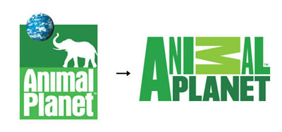
One logo that really took me back is the new Animal Planet logo. For those that don't know, Animal Planet is a channel on TV that dedicates a large portion of their time to shows about animals. The one thing that really catches me off guard is the sideways "M" in the Animal part of the logo. I really don't understand why they did this. Another thing was removing the elephant from their logo. I feel that since the company promotes animals, they should have at least left an animal in there.


Here is one logo redesign I can actually stand. I really like how they didn't change it up too much and kept most of the older logo in tact. They just gave the older logo a twist and made it look fresh, updated and modern.


And just for giggles, I thought I would throw the MTV logo in here. Notice anything different? At first glance, not really but they actually removed the "Music Television" from the bottom. As much as I hate to say it, this change was needed. I honestly can't remember a time that wasn't 4am when MTV was actually playing music or music videos. They changed the logo to evolve with the company and it was pretty fitting. They kept their brand identity why dropping the unnecessary pieces of it.

All logo images taken from Adweek.com.

And The Projects Continue...

My pledge to post everyday has completely flopped however, I'm still keeping busy! Here is a bit of what I've been messing around with as of late.

 Songpack icons for ReRave


A preview of my final project for Digital File Prep
 Little guys made out of just folded paper and tape..I lacked glue Ha.


 Continuing work on the Pump it Up Pro+ Project. This including video editing as well as audio editing in addition to creating the step sequences for each level and song. (This video is a little muddled as it was taken at the location it's currently being tested at for player reactions and opinions)

Thursday, April 7, 2011

Project #4 - Full Page Publication Ad

The next project in Digital File Prep is a magazine ad that will be full page. The guidelines for this project are set by the magazine we each chose to advertise in and we were told to submit our files as we would if we were actually submitting it to the magazine publisher. Our only real requirement for this project is to do a full page ad and include a Microsoft Tag. Microsoft Tag's are very similar to the QR codes that we had used in our notepad project but they are proprietary to Microsoft an require their special reader on your smart phone. One key difference with the tags is that they aren't near as ugly looking as the QR code. They can either be in black and white, 4-color CMYK or actually have an image embedded in them. In addition to this, If you are the creator of the tag, you are able to log into your account and check how many times the tag has been scanned and checked out. Very cool stuff!

Now, onto the project. I chose to advertise bikes in Men's Health. According to the specifications given by the magazine, my document size will need to be 11.22x8.46 with a bleed of .12 all the way around. My ad will contain a 4-sided bleed image that encompasses the entire page with minimal text and content to take away from the image. The content of the ad will be the image, a logo of the company, the Microsoft Tag and a tagline of "Conquer the Trails". My target audience will be men from ages 25-40 that enjoy biking in tough terrains. My call to action will be to get them to check out the bike, as well as scan in the Microsoft Tag and get more information about the product.

The final product
The background image I used is a Duotone image. One thing that I found challenging about this project is that the magazine I had chosen gave me their measurements in millimeters so I needed to convert them over to inches and then they didn't state exactly what the bleed, trim size and live area were. This required me to do a little math (Which I'm absolutely terrible at). Overall, I'm pleased with the final product and how it turned out in the end. 

Image of man on bike licensed under Creative Commons. Microsoft Tag is copyright Microsoft. All other images created by Jordan Frederick

Monday, April 4, 2011

Spring Break Challenge!

In Digital File Prep, We were given the challenge to take pictures of interesting things that caught our eye (for both good and bad reasons) and display them on here. I took a little mini-tour of Florida in Jacksonville, Orlando and Tampa and here are my findings.

This was taken at Universal Studios' Island Of Adventure in the Harry Potter area. I thought this sign looked kind of cool because it was themed really well to match the Harry Potter feel.
Here is a marquee header for an arcade dance game in Jacksonville. I really enjoyed this one because I love the colors they used and the curvy lines and dots really really reallyyyyyy entice me.


I'm a giant fan of scenarios that give the feeling that things are larger than life. This was taken from the Toy Story Midway Mania (My favorite movie ever) ride in Disney's Hollywood Studio. It was the queue area leading up to the ride. Unfortunately, the ride conveniently broke down 3 minutes before the park closed after waiting in line for 40 minutes. I was super bummed to say the least.

Here is a sign that was for a shirt shop on Daytona Beach in Daytona Florida. Not much to say here because it's fairly explanatory but I just love that it's a monster wearing a shirt for the shirt place and they used the shirt as a logo.

I had no idea that they actually had Pringles vending machines but I've always been a fan of the Pringles logo. The little man gives the brand such character and life.
This was taken in the D-Street store at Downtown Disney. I really liked how they gave the lettering an old school feel and used the actual figures in the sign. I am addicted to the Vinylmation brand after visiting this store.  They are small vinyl characters that are all different designs and even ones you can design yourself. Very cool stuff.

Gem Tower was an awkward hotel right on Clearwater Beach. I thought this was a little awkward and honestly looked a little dated and old. A little cheesy as well.

Finally we have another arcade game called Dead Heat. What I really liked about this is that instead of using a traditional sign for the game, they actually integrated the logo into the large "pops" on top of cabinet. Not only that, the cabinet looks way cool with the blue lights.

So there you have it, A small snippet of my trip. I found more stuff that was pleasing to the eye rather than annoying but don't get me wrong, there was quite a few annoying designs I saw.

Thursday, March 31, 2011

Project #3 - Newspaper Publication Ad

For our next assignment, We are working on a newspaper ad using the PSU Collegio advertising guidelines and pricing for space. We were given a $100 budget and told to work within that budget. The Collegio charges $4 per "newspaper" inch with each column being a different size. The ad I chose to design is a long ad that makes up a giant sub sandwich. Each piece is 5x3 newspaper inches which is 9.67x3 inches big. This comes out to $60 (3x5=15x4) total.


The store I chose to make an ad for is a fictional sub sandwich shop called "Lenny's Long Sub Shop".  The ad will have a .25 margin and no bleeds featuring a frame in the middle of the 2 sandwich sides. My call to action will be to get the customer within the target audience of college kids to come in and use one of two coupons provided within the ad. I will also be scanning in my sub sandwich I designed and will be using it in the ad as a bitmap image.

The final product
All bitmap images created by Jordan Frederick. No other images used in the piece.

Wednesday, March 30, 2011

ReRave is out NOW!


After a tiny delay from Apple's approval process (And a tiny delay in me posting this), ReRave is finally available in the iTunes App Store! The game is $1.99 and it comes with 3 songs to start with. From there, you are able to purchase and download free and premium songpacks of about 5 songs each.
ReRave is also featured as one of the App Store's "New and Noteworthy" games and has consistently been in the Top 10 of the music game charts in the store as well! (It topped Rock Band Reloaded HD, Quite a feat!). If you guys haven't checked it out, I would definitely recommend it and I'm not just saying that because I did some work with it.

Monday, March 7, 2011

Look Ma! I'm Famous!

Not quite, but I am in a video game for iPad, iPhone and iPod Touch! Here are some screenshots from the almost finished ReRave version coming out March 10th.